Our colour and writing products are manufactured in our workshops in Geneva since 1915.
- FREE ENGRAVING UNTIL JANUARY 5TH, 2025 INCLUDED ON OUR HAUTE ÉCRITURE COLLECTIONS.
- FREE GIFT WRAP AND PERSONALIZED MESSAGE. FREE DELIVERY ON ORDERS OVER 60€.

CHOOSING THE RIGHT COLORS FOR YOUR ARTWORK
Adding colors to your drawings or your paintings is not done at random. As well as your personal preferences, choosing the perfect colors that will reflect your emotions and the atmosphere you wish to convey to your artwork requires a bit of knowledge. So bring out your best coloring pencils, your favorite coloring book or a sheet of paper, and follow our tips to learn how to paint, draw and use color correctly. Create color harmony and express your creativity with Caran d'Ache.
UNDERSTANDING COLOR THEORY AND THE COLOR WHEEL
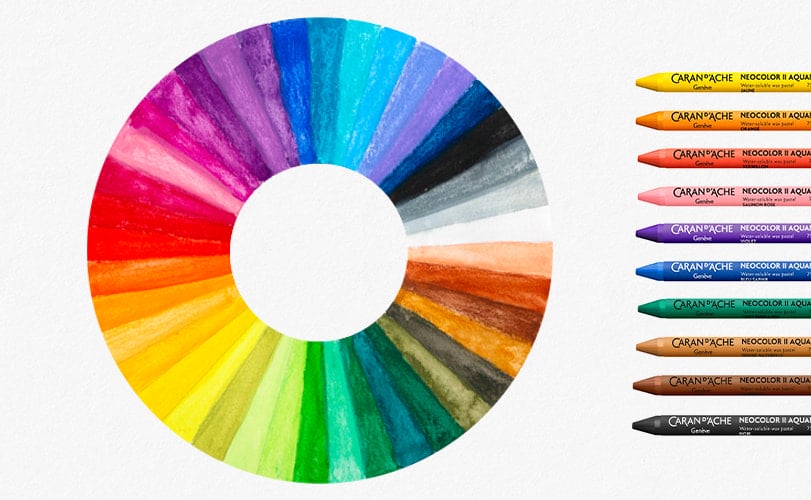
Color theory allows us to understand the relationship between colors, how they interact, but also how they influence our perception and the emotions they provoke. At the heart of this theory is the color circle, which organizes colors:
• Primary colors: red, blue and yellow.
• Secondary and tertiary colors: colors made by mixing primary colors.

The color wheel also makes it possible to harmonize colors:
• Analogous colors are next to each other on the color wheel and are combinations which are pleasant to look at.
• Complementary colors, which face each other on opposite sides of the wheel, create a vibrant contrast and are eye-catching.
• Analogous colors are next to each other on the color wheel and are combinations which are pleasant to look at.
• Complementary colors, which face each other on opposite sides of the wheel, create a vibrant contrast and are eye-catching.
CHOOSING THE RIGHT COLORS FOR A DRAWING
Do you enjoy painting and drawing but find it difficult to find the right colors to associate? Depending on the atmosphere that you would like to evoke in your artwork, each color will conjure up different associations and emotions. For example, red symbolizes passion or danger, whereas blue is reminiscent of serenity or sadness. Understanding these associations will allow you to efficiently convey a mood and a message in a drawing or a painting.
Using warm hues such as red and orange create a feeling of warmth and energy, while cold colors such as blue and green will inspire calm and serenity.
A carefully chosen color palette can transform a simple drawing into an emotionally charged and motion charged and deep work of art.
Top tip: while adding white to a color will make it lighter, adding black, on the other hand, is not the right way to create darker shades. Adding black to a color will, on the contrary, reduce color saturation and the shadow won't look natural. Rather than use pure black, opt for complementary colors to create shadows.
Would you like to start drawing or painting but don’t know where to start? Do you find it difficult to set your pencil to paper and find the right colors for your drawings?
Discover the Creative Box by Caran d’Ache. Within the box, you will find all the supplies you need to set your creativity free (coloring pencils, felt tip pens, paint, drawing pads and many other accessories) as well as access to three online lessons. Drawing and coloring are not activities reserved solely to children, so treat yourself and dare to awake the artist within you with Caran d’Ache by your side.
Discover the Creative Box by Caran d’Ache. Within the box, you will find all the supplies you need to set your creativity free (coloring pencils, felt tip pens, paint, drawing pads and many other accessories) as well as access to three online lessons. Drawing and coloring are not activities reserved solely to children, so treat yourself and dare to awake the artist within you with Caran d’Ache by your side.
8 TIPS FOR CHOOSING AND USING THE RIGHT COLORS FOR YOUR DRAWINGS
Using primary colors (red, blue and yellow) and their complementary colors (green, orange and purple) together will create color harmony. Here are some tips on how to use these colors:
• Create color harmonies. Primary colors and their complementary colors are often used to create harmonious and pleasing color schemes. For example, by using red and green together you can create a harmony of eye-catching complementary colors.
• Balance your colors. Complementary colors tend to mutually reinforce each other when they are placed next to each other. That means that if you're using red and green in your drawing, make sure you balance them out so that one color doesn't dominate the other.
• Create contrasts by using complementary colors. Play with contrasting complementary colors to make key elements of your drawing pop out. For example, placing a red object in front of green background will make it stand out.
• Avoid too many colors. Using too many complementary colors in a drawing can lead to a disorganized and visually confusing composition. The key is to limit your palette to just a few well-chosen colors and use them in a careful way to create harmonious and coherent composition. Use complementary colors with moderation and add neutral colors or shades from the same family to balance your composition.
• Using predefined color palettes is an excellent starting point for those who are just starting drawing and who want to concentrate on the fundamental features of color theory such as saturation and brightness.
• Don't be afraid to try unusual color combinations or new techniques to mix your colors, you could easily make some surprising discoveries and enrich your palette.
• Learn about each medium's specificities. Mixing colors will be done in different ways if you're using coloring pencils, watercolor, oil or wax pastels, paint, etc.
• Consider the lighting when you choose your colors. On a drawing or a painting, colors are influenced by their environment, most notably light, for example, a color can appear lighter in natural light and be a darker shade under an artificial light.
Would you like to try painting and drawing lessons with artists that have unique styles? Perfect your sketching technique, try out watercolor and learn to use coloring pencils and all the other media from the Maison Caran d'Ache thanks to the Creative Class by Caran d'Ache online platform. Discover all the secrets to successful painting and drawing..
There you'll find online classes and workshops led by talented artists who will make you see painting and drawing in a new light.
There you'll find online classes and workshops led by talented artists who will make you see painting and drawing in a new light.
Free from 60€ purchase.
Possible return under 14 days.
Possible return under 14 days.
Visa, Mastercard, Paypal.
Monday to Friday from 10am to 7pm and Saturday from 10am to 5pm.
+41 (0) 848 558 558
(Calls from Switzerland : at local rate. Calls from abroad : at telecom provider’s international rate.)
+41 (0) 848 558 558
(Calls from Switzerland : at local rate. Calls from abroad : at telecom provider’s international rate.)

.jpg)
.jpg)
.jpg)
.jpg)
 Deutschland
 Austria
 Belgium
 Etats-Unis
 France
 Italy
Italy Japan
Japan Netherlands
 United Kingdom
 Switzerland